11 minutes of reading
Key takeaways
- A recognisable brand identity bases its visual choices on the company’s work, personality, vocabulary and distinctive features.
- Templates reused without adapting their structure make brands look alike by imposing a shared visual grammar on layout, typography, composition and message hierarchy.
- A distinctive brand identity stays consistent when it repeats its own visual rules across different formats while leaving enough flexibility for the content.
- The cited studies associate an asymmetrical logo with a brand perceived as more dynamic. This association is not enough to determine the right logo for a brand.
- A distinctive visual proposal connects each detail to an observable feature of the company and each formal decision to the intended personality.
In this article
- How can you keep your brand from looking like every other brand in your sector?
- Why do the same templates end up making brands look alike?
- How are computer-generated images received?
- Do you have to choose between visual consistency and distinctiveness?
- What does a logo’s shape communicate before its name is even read?
- How does observing your company inform a recognisable brand identity?
- What questions should you ask before approving a visual proposal?
- How can you now choose a brand identity that does not look like every other brand in your sector?
How can you keep your brand from looking like every other brand in your sector?
To define a brand identity, first look for what is already yours: the way you work, the details you care about, your vocabulary, your convictions and your references. Also think about what you want to leave in your audience’s mind.
These observations guide colour, drawing, typography or the relationship between text and image. This is how I build my brand identities through observation and drawing.
Why do the same templates end up making brands look alike?
A template already contains decisions: the title size, the image proportions, the number of typographic levels, the space left for text or the way information is ordered. By repeatedly filling these frameworks without questioning them, different companies adopt the same page rhythm and message hierarchy.
Changing the colours, photographs or logo is not enough to change this reading path. The same problem appears in presentations, social media posts and sales documents built from prefabricated structures.
Before adopting a template, identify the decisions it makes for you. Choose which you want to keep, then change at least one structural constraint: the grid, the typographic scale, the balance between white space and content, or the way an editorial illustration shapes the reading experience.
How are computer-generated images received?
Chamberlain et al. (2018) found that identical images were judged less favourably when presented as computer-generated. This bias decreased when participants saw a robot painting: making the act of creation visible improved the image’s reception here.
Do you have to choose between visual consistency and distinctiveness?
No. A recognisable palette or a consistent way of framing images can connect very different formats. Resemblance to competitors emerges when sector conventions dictate these choices.
In my process for creating a brand identity, I start by clarifying the business, audience, formats and elements specific to the brand.
Keep a rule if it helps people recognise the brand across several formats while leaving enough flexibility for the content. The same relationship between drawing and typography can, for example, connect packaging to a website without imposing the same image everywhere.
When establishing the brand guidelines, state each rule with its brand-specific rationale. Discard any whose only justification would be “this is how our sector presents itself”.
What does a logo’s shape communicate before its name is even read?
A logo’s geometry communicates a personality, particularly through its degree of symmetry. Henderson and Cote (1998) show that a logo’s design influences its recognition.
Across five studies, Luffarelli et al. (2018) show that an asymmetrical logo appears more stimulating and better suits a brand with a dynamic personality; the effect applies only in this case. This match between the shape and the stated personality improves brand evaluations and can also affect its financial valuation.
Meanwhile, Bajaj and Bond (2018) find this association between logo asymmetry and a brand personality perceived as dynamic across four experiments.
When choosing a logo, compare two versions with exactly the same name, colour and typography. Then decide whether symmetry or asymmetry best expresses the temperament you want for your brand identity.
A children’s bookshop that hosts read-aloud sessions and drawing workshops can test an asymmetrical version if it wants to express movement and surprise. However, the general association reported is not enough to determine the logo that suits it. This does not amount to claiming that a curve or an angle has a fixed meaning everywhere.
How does observing your company inform a recognisable brand identity?
A generic tool knows a category and its common representations. To find forms specific to your company, observe working gestures and details of the premises on site.
- Start by following a working gesture from start to finish. Note the posture and the order of actions, along with the tools actually used. Also record details that have become invisible through familiarity.
- Then look at the premises without staging them. Draw frequently used routes or marked surfaces; observe how objects are stored and displayed.
- Gather the objects used in the work. Draw their silhouettes and how they fit together, noting signs of use. An angle or an outline may be enough to provide a form; also look for repeated rhythms.
- Finally, observe the interaction with the public. What objects do they handle? Among the materials they consult, note which they keep.
Drawing transforms these records into usable forms: the outline of a repaired tool can provide a motif, a route through a place can suggest framing. Standard image generation can imitate a requested style, but cannot independently guess what nobody has shown it.
I apply this method to illustrated books, characters, editorial illustration, brand identities and projects across multiple formats.
“To define a brand identity, first look for what is already yours: the way you work, the details you care about, your vocabulary, your convictions and your references.”
Discover Nicole’s illustrated books and editorial work.
Two published children’s books, editorial commissions and hand-drawn identities.
What questions should you ask before approving a visual proposal?
Before approving a visual proposal, ask three questions.
Who else could receive the same proposal? If almost every company in the sector could receive the same proposal, ask what connects it to yours.
The second question concerns where the details come from: point to a specific element in the image and ask which aspect of your work it corresponds to.
For the third question, “What shape conveys the personality you want to express?”, words such as “modern” or “elegant” are not enough. Ask for a clear explanation of the link between the chosen geometry and the intended character.
How can you now choose a brand identity that does not look like every other brand in your sector?
Apply the three tests defined above to every template, generated image or editorial illustration, including when the drawing has been cleaned up digitally. As I explain on my Clients page, an identity can start with a hand drawing, then be vectorised and composed digitally. The vector file can retain the linework of the hand drawing it came from.
Place the proposals side by side. If you are still undecided between two proposals, request a variation focused on their weakest point, then compare again.
Frequently asked questions
How can you check that a brand guideline truly belongs to the brand?
Each rule must be traceable to a reason specific to the project. A convention kept solely because it is common in the sector mainly makes the brand resemble its competitors.
Which parts of a template should you be able to adapt to your brand identity?
The grid, typographic scale and distribution of white space can become choices specific to the brand. The template remains relevant if it serves as a technical base without imposing the entire visual structure.
How can signs of use become distinctive visual elements?
The outline of a repaired tool or the silhouette of an object used daily can provide lines and motifs. Drawing transforms these observations into usable forms without hiding their origins in the work.
Does digital cleanup necessarily erase a hand drawing’s character?
Vectorisation and digital composition can preserve the traces of recognisable work. The final file then rests on choices drawn from observation and drawing before cleanup.
Is an attractive finish enough to prove a visual proposal is distinctive?
The quality of the finish is not enough if no detail in the visual can be linked to a specific element of the project. A proposal deserves to be selected when its drawing, composition and details provide evidence specific to the company.
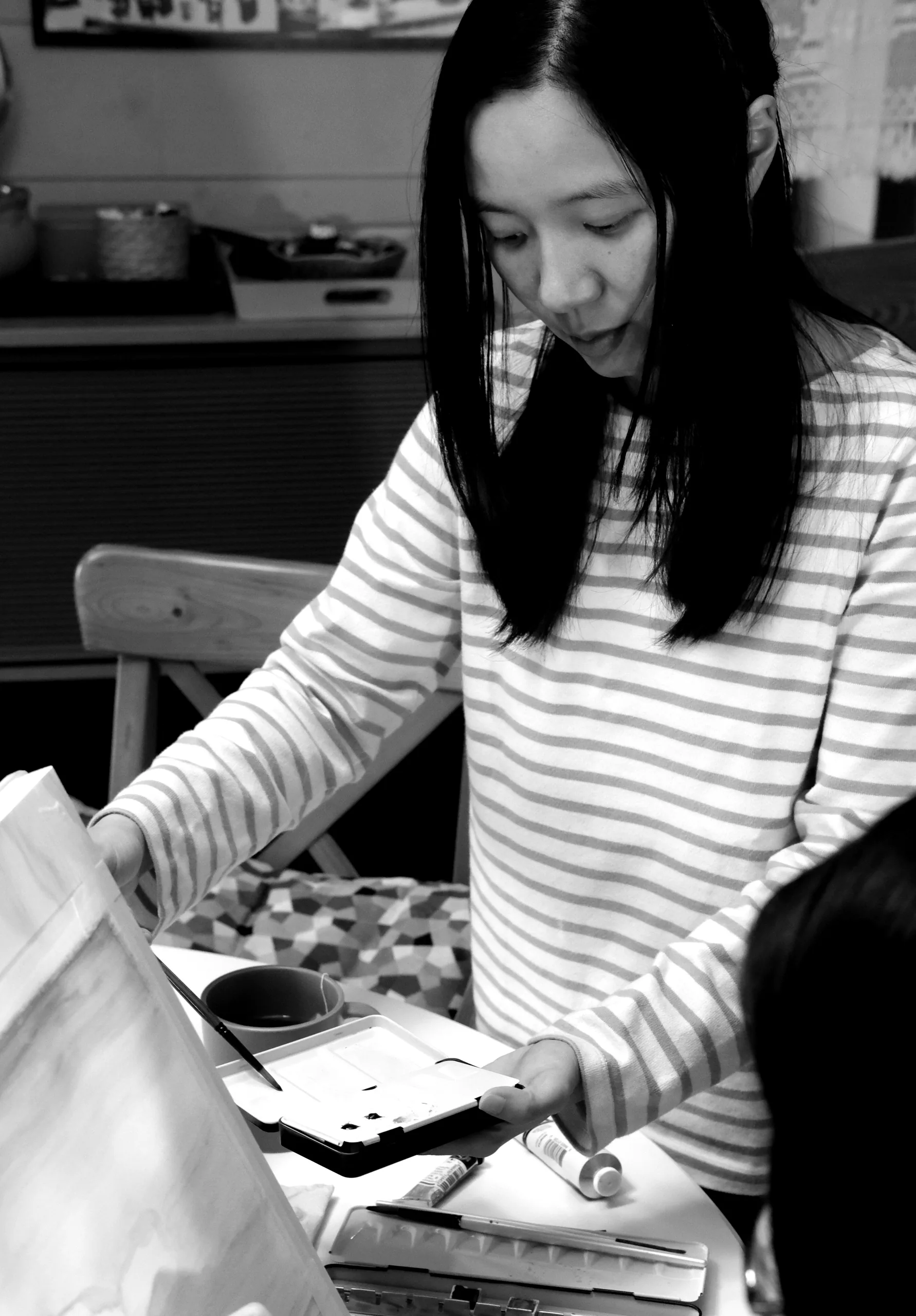
Nicole Hénusse · Illustrator and author
Nicole Hénusse is an illustrator and author of two children’s books published in Belgium. Her practice brings together illustrated books, editorial illustration, hand-drawn brand identity and observational drawing.
Do you have a book to illustrate or an editorial project?
Nicole takes on a small number of projects each year. Tell her about yours.