11 minutes of reading
Key takeaways
- A precise visual bible and ongoing art direction maintain the identity of characters throughout a picture book.
- A reference sheet establishes the proportions, palette, clothing, expressions and signature details that make a character recognisable.
- A continuity test with wide shots, close-ups and movement reveals the differences in appearance that go unnoticed when each image is judged separately.
- Good illustration for children combines visual consistency with appropriate emotion, clear readability and precise alignment with the text.
- A representative sequence of three to five images allows you to assess the corrections needed and choose between generation, retouching and drawing.
In this article
- How can you keep characters consistent in a picture book despite the limits of AI?
- What are the visual reference points that keep a character from changing between images?
- What can the continuity test reveal from several scenes?
- Why is a series of consistent images not enough to create good illustration for children?
- Where does AI reach its limits in the production of illustrated books?
- How can you decide whether to use AI to keep characters consistent in a picture book?
How can you keep characters consistent in a picture book despite the limits of AI?
First, to keep characters consistent in illustrated books, you need to establish the identity of each character in a precise visual bible. It is then necessary to maintain ongoing art direction throughout the production. The work of Zhou (2024), which addresses this problem, documents the difficulty of preserving recurring characters, subjects and settings in a sequence of generated images. An image can seem successful while introducing a variation that subtly weakens the character across the pages. The bible then serves as a shared reference for assessing each of the proposed images. Art direction allows you to select, correct or discard the results. The tool thus remains in service of the chosen visual language, whether for children’s illustration, editorial illustration or a brand identity.
What are the visual reference points that keep a character from changing between images?
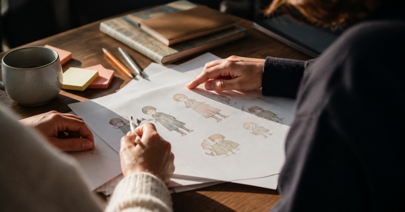
A reference sheet thus brings together the proportions, palette, clothing, expressions and views from several angles. It establishes the reference points that make a character recognisable across images. The study by Chen (2022), which addresses the consistency of recurring characters, subjects and backgrounds in generated stories, describes this difficulty well. Without a shared document, the volume of a hairstyle can increase, a face can lengthen or the cut of a jacket can change. Yet it is each image that remains plausible when assessed separately.
Above all, the sheet needs to distinguish fixed elements from variable elements. The structure of the face, the silhouette, the dominant colours and the signature details remain stable. The posture, gaze or drape of a garment can change. For illustrated books, this sheet also helps to maintain a consistent scale between the head, body, hands and accessories. It should not constrain the expressiveness characteristic of illustration for children.
In practice, I start with drawings of the character from the front, in profile and in three-quarter view. I add a rear view when the costume has details that are important. I then isolate a small palette with the precise references for its colours. I also record the construction rules that should not be freely interpreted: eye height, nose shape, hairline, coat length or recurring motif. An expression sheet completes the set with a few variations that are truly useful to the story. They are shown on the same face and with the same degree of stylisation. Before approving a new image, I compare it with this sheet point by point, as I would for a brand identity or a series of editorial illustrations. The differences become visible, and you can discuss and correct them.
“First, to keep characters consistent in illustrated books, you need to establish the identity of each character in a precise visual bible.”
Discover the illustrated books and editorial work by Nicole.
Two published books for children, editorial commissions and identities that are drawn by hand.
What can the continuity test reveal from several scenes?
In practice, a continuity test reveals the differences in appearance that go unnoticed when you judge each image separately. It compares the same character in wide shots, close-ups and movement. Successful images can deceive you. Placed side by side, the scenes suddenly show that a face looks more adult or a silhouette loses its solidity. The importance of certain features also changes with the framing, although each composition seemed convincing when viewed separately. For children’s illustration, it is useful for this comparison to draw on a few representative situations from the picture book. You then need to observe the figure as a reader would while turning the pages. What remains stable from a distance should still work when the viewer looks more closely. What looks right in a calm pose should also remain recognisable when the body leans, runs or turns, with its movement.
Why is a series of consistent images not enough to create good illustration for children?
Even so, a series of consistent images is not enough for the task. Good illustration for children also needs to convey the right emotion, guide reading and serve the text without overloading it. A character can retain its face, clothing and colours, yet display an expression that feels too distant for the scene. Its reaction can also be so exaggerated that it deprives the reader of their own interpretation. It is then the visual continuity that becomes a superficial quality. The editorial challenge lies in the choice of gaze, posture and what the image deliberately leaves unresolved.
Furthermore, it is the clarity of the narrative that requires the same attention. The study by Pike (2010) shows that illustrations can contribute to children’s inferential comprehension, but that visual details unrelated to the text can compete with it and reduce comprehension among beginning readers.
That is why, in illustrated books, each visible element needs to have a clear function on the page. This requirement remains valid even when the visual world invites you to multiply the appealing touches that it contains. Alignment with the text requires deciding what the image confirms and what it adds. You also need to determine which part of the story it carries alone, according to the attention and interpretation abilities associated with the intended age group. The work of editorial illustration involves rereading the sequence as a child would experience it. You then need to remove a detail that distracts the eye, adjust an ambiguous expression or simplify an overloaded composition. The brand identity of the book should remain intact.
Where does AI reach its limits in the production of illustrated books?
However, AI reaches its limits when the scene calls for a complex pose or a precise interaction between several characters. It is also the exact reappearance of an accessory across the pages that poses a problem. A hand that grasps an object, two bodies that touch or a garment that moves multiply the spatial relationships to preserve in one image. The difficulty extends to the story as a whole: the study by Li (2019) presents the consistency of recurring characters, subjects and backgrounds as a challenge specific to generating stories in pictures. Yet a seemingly minor detail can have a narrative function or contribute to a brand identity. That is the case with a recognisable bag that changes hands, closes, disappears behind a body and then reappears open several pages later.
In practice, for illustrated books, a concrete decision is to flag images with demanding constraints as early as the scene breakdown. This concerns physical contact, simultaneous actions, objects that are handled and changes of intention that are perceptible from page to page. These passages need to be constructed and checked by the illustrator as connecting points in the story, with deliberate local corrections. Less constrained scenes can give the tool greater latitude without compromising the precision expected of illustration for children.
How can you decide whether to use AI to keep characters consistent in a picture book?
Thus, to decide whether to use AI, you should first produce a short representative sequence. The choice between generation, retouching and drawing is then based on the differences that are actually observed. The test can cover three to five images taken from significant moments in the project. It should include the framing, actions and level of finish planned for the picture book. A series of simple portraits would give a misleading impression if the final pages contain group scenes or changes of viewpoint. It is better to test the difficult conditions early. The result should then be examined as a prototype for production. What are the corrections that recur with each image? Which remain occasional? How far can you intervene without losing the intended visual language? The study by Ruiz (2023) shows that a model can be adapted using a small set of reference images associated with an identifier specific to the subject.
- Continue with generation when the differences are rare, localised and compatible with the level of quality required for the project.
- Plan for manual retouching when the composition works, but some recurring details have to be corrected precisely.
- Return to drawing for images that require too many revisions to get right, or when the corrections end up dictating the method instead of serving the image.
Finally, the decision becomes concrete. For illustrated books, a few revisions that are acceptable in a short sequence can become burdensome across thirty pages. In editorial illustration, working on a single image can sometimes allow for a greater degree of finishing. A brand identity that is highly codified also calls for a lower threshold of tolerance. This first trial therefore allows you to estimate the time needed for corrections. It helps to define the pages that require the illustrator’s hand and to reserve generation for places where it offers real flexibility. The choice of tool follows from the project, its economics and the degree of control needed. The method can vary from scene to scene.
Frequently asked questions
How can you use the visual bible to approve a new image?
Compare each proposed image with the bible before adding it to the sequence. It allows you to identify a discrepancy, then decide whether to correct it or discard the image.
Which of the details can vary without making a character unrecognisable?
The posture, gaze and movement of the clothing can change according to the scene. The structure of the face, the silhouette, the dominant colours and the distinctive features need to remain stable.
What framing should you plan for a continuity test?
Test the character using framing that corresponds to the important situations in the picture book. The comparison needs to include distant views, close views and actions to reveal differences that are invisible in an isolated image.
Which pages should be checked directly by the illustrator?
The pages that include physical contact, simultaneous actions or objects being handled require checks by the illustrator. These passages require local corrections to preserve the precision of the story.
Which visual details should you remove from a page for children?
The elements that distract the eye or have no clear function on the page need to be removed. The image needs to complement the text without competing with it.
Nicole Hénusse · Illustrator and author
Nicole Hénusse is an illustrator and author of two books for children published in Belgium. Her practice brings together illustrated books, editorial illustration, brand identities that are drawn by hand and drawing from observation.
Do you have a book to illustrate or an editorial project?
The number of projects that Nicole takes on each year is small. Tell her about yours.