13 minutes of reading · Last reviewed by Nicole Hénusse on 2026-08-07
Key takeaways
- Because traditional training gives an image a foundation in drawing, volume and expression that digital tools do not create on their own.
- Learning drawing, anatomy and light makes it possible to simplify an image without emptying the character of weight, gesture or presence.
- These classics show that a very simple line can carry demanding construction.
- The flat style dominates many children’s catalogs because digital tools have made image production more accessible, and therefore more abundant.
- In many Japanese images, the line sometimes seems quick.
In this article
- Why choose an illustrator with traditional training for a children’s book?
- What does learning drawing, anatomy and light change in an image for children?
- What do classics such as Peter Rabbit, Winnie-the-Pooh or The Aristocats show?
- Why does the flat style dominate children’s catalogs so much?
- What counterpoint does Japanese drawing bring to the Western market?
- How can you read an illustrator’s portfolio without being guided only by style?
- When should you ask for a custom illustration rather than an image that is only trendy?
- How can you choose an illustrator with traditional training for a children’s book right now?
Why choose an illustrator with traditional training for a children’s book?
Because traditional training gives an image a foundation in drawing, volume and expression that digital tools do not create on their own.
Indeed, software can speed up production. It offers textures, effects, quick corrections, sometimes real efficiency in the final stages. But it does not decide what a character carries in their gaze. It does not decide how a body holds itself in space, or what discreet tension makes a scene sensitive. These choices come from an eye trained to observe, simplify and construct.
For a children’s book, this difference matters from the first sketches. The child does not only read a pleasing shape. The child recognizes an intention in a posture, a hesitation in a mouth, a presence in a face. An illustrator with traditional training can then work digitally if the project requires it. But the tool remains at the service of the drawing.
The value of a custom illustration begins there: in the ability to choose a visual language adapted to the book, rather than a rendering imposed by a technical habit. The result can be contemporary, gentle, more graphic or more pictorial. The essential point remains the mastery beneath the visible image.
In addition, this foundation also influences the visual identity of an editorial project. Drawing and brand image are not reduced to a palette, nor to a style recognizable at first glance. They rest on a deeper consistency: a way of giving weight, breath and humanity to images. This is often what an illustrator’s portfolio reveals, even before the subject represented.
What does learning drawing, anatomy and light change in an image for children?
Learning drawing, anatomy and light makes it possible to simplify an image without emptying the character of weight, gesture or presence.
A character intended for children can have a large head, very thin arms, tiny feet, a face almost reduced to two eyes. Stylization accepts these shifts. But for it to hold together, you need to know what has been moved, shortened or exaggerated. A knee that bends, a shoulder that rises, a hand that rests on a table: these details give the body an internal logic, even when the form remains simple.
Thus, light plays the same role. It indicates where the character is, what weighs on them, what surrounds them. A shadow under a chin, a lit edge on a cheek, a more muted area at the back of a room are sometimes enough to establish a scene. Without this observation, the image can remain pleasant on the surface. But the eye does not truly believe in the space.
In a custom illustration, this discreet construction matters a great deal. It makes it possible to adapt the level of simplification to the reader’s age, the tone of the story and the project’s visual identity. Drawing does not seek to copy reality. It uses it as support to invent a form that is more readable, more expressive and more accurate.
An illustrator’s portfolio often reveals this difference in ordinary poses: a seated child, an animal turning its head, a character hesitating before entering. Nothing spectacular. Just a presence that holds.
What do classics such as Peter Rabbit, Winnie-the-Pooh or The Aristocats show?
These classics show that a very simple line can carry demanding construction. Peter Rabbit is not a busy drawing at all. Winnie-the-Pooh often holds together in a few round, almost naive forms. The Aristocats retain a supple elegance, readable in an instant. Yet these images do not give the impression of being poor. They breathe because the simplification has been chosen with precision.
Even so, a light outline is not enough to create this presence. You need to sense where the axis of the body passes, how a paw is placed, how a head tilts, how a gaze changes a character’s nature. In Peter Rabbit, the little blue jacket becomes believable because the body underneath exists. In Winnie-the-Pooh, the roundness seems soft rather than limp. In The Aristocats, the line keeps the memory of movement, even when the image is still.
This is what is often confused: an image that is easy to read and an image that is easy to make. The result seems natural, almost obvious, but this obviousness comes from constructed drawing. The hand removes a great deal, without removing the intelligence of the form.
For a custom illustration, this difference matters. A visual identity can remain delicate, tender, childlike, while keeping real graphic solidity. The drawing does not seek to show its effort. It simply gives the character enough structure for the child to recognize it, find it again and want to follow it page after page.
“The value of a custom illustration begins there: in the ability to choose a visual language adapted to the book, rather than a rendering imposed by a technical habit.”
Why does the flat style dominate children’s catalogs so much?
The flat style dominates many children’s catalogs because digital tools have made image production more accessible, and therefore more abundant. This massive presence ends up taking on the appearance of a general taste.
In practice, software such as Procreate, Adobe Illustrator and other creative tools has simplified the material production of an illustration. They make it possible to place clean shapes, correct quickly, test colors, deliver a sharp image without going through all the slow stages of traditional drawing. This progress is real. It has also opened the market to many people able to use the software, without necessarily having received solid artistic training.
The result can be seen in catalogs. Many images share the same flat areas, the same simplified silhouettes, the same faces reduced to a few signs. By being everywhere, this visual language seems natural. You end up believing that it corresponds to a deep demand from the public. It often corresponds to what is fastest to produce, easiest to adapt and most immediately readable as a thumbnail.
Visibility creates a habit.
However, for a children’s project, this habit can become a trap if it replaces artistic choice. A custom illustration should not merely take up what is already widely circulating. It must serve a precise visual identity, with drawing and brand image capable of distinguishing the book instead of adding it to a family of interchangeable images. An illustrator’s portfolio is also read at this point: not only in the cleanness of the execution, but in the ability to choose a visual language because it serves the project.
What counterpoint does Japanese drawing bring to the Western market?
Japanese drawing brings a valuable counterpoint to the Western market: it reminds us that an image intended for storytelling can remain highly stylized while keeping strong discipline in movement, character and narration.
In many Japanese images, the line sometimes seems quick. It can seem light, almost obvious. Yet the character holds together. The body has a direction, the gesture an intention, the gaze a place in the scene. Even when the proportions are far from realism, you sense a knowledge of drawing behind the simplification.
Thus, this contrast is important for Western children’s illustration, because it shifts the question of style toward the internal solidity of the image. An expressive silhouette does not depend only on an appealing outline or a current palette. It depends on the way the body moves forward, falls, hesitates, listens. An unconvincing pose is quickly visible, especially in a book where the child finds the same character again from page to page.
Japanese drawing also shows how much visual narration gains when the artist thinks of the image as a sequence of forces. A coat that follows a movement, a hand holding back an object, a head turned before the rest of the body: these details give the character a life of their own. They build a visual identity that rests not only on a recognizable form, but on a way of inhabiting space.
In practice, for a custom illustration, this lesson matters. The goal is not to imitate a Japanese style, but to retain this standard: choose a visual language adapted to the project, then support it with drawing solid enough to carry emotion and action.
How can you read an illustrator’s portfolio without being guided only by style?
To read an illustrator’s portfolio, you need to look at what the images hold beneath their surface: construction, light, expression, atmosphere and consistency of the visual world.
First, style catches the eye. It can be gentle, graphic, very colorful, minimal, more pictorial. But the real examination begins after this first impression. Does a character hold in space? Does their body have an axis, even in a simple pose? Do the hands, feet and shoulders seem to belong to the same body? An image can be highly stylized and remain solid. Another can appeal through its palette, then lose its strength as soon as the eye looks for volume.
Next, light gives another clue. A weak or arbitrary shadow quickly makes a scene flat, even if the colors are harmonious. Conversely, well-considered light organizes the image. It guides the eye, gives an hour, a season, sometimes a silence. It also helps you understand whether the illustrator composes an atmosphere or merely applies an appealing finish.
You then need to observe the expressions. Not only the big smiles. A slightly worried face, a restrained posture, a sideways glance can say a great deal in a children’s book. These nuances matter for a custom illustration. They carry the tone of the story as much as the setting.
Finally, the portfolio must show continuity. The images can vary, but they must reveal the same intelligence of drawing and brand image: a way of choosing forms, colors, silences, details. This is where the visual identity begins to be read.
When should you ask for a custom illustration rather than an image that is only trendy?
You need to ask for a custom illustration when the book must carry a recognizable visual identity beyond its first publication. An image that is only trendy can respond to the mood of the moment, please quickly, enter a catalog without friction. It fulfills an immediate function. But an editorial project that wants to remain identifiable asks for something else: a consistency of gaze, tone, drawing and brand image.
In other words, the question then becomes editorial. What trace should the book leave? If the image resembles too much what is already circulating, it accompanies the text without truly giving it its own face. An illustration designed for the project, on the contrary, can bring forth characters, colors, gestures and an atmosphere that are associated precisely with this book. Not only with a graphic trend.
This difference matters especially for books that you want to see live over time. Adults buy art books, prints, special editions, figurines or reproductions of images that marked their childhood. They return to them because these images have entered their emotional memory. A strong visual identity can therefore go beyond the printed object: it becomes a presence that you recognize, keep and pass on.
The illustrator’s portfolio helps you sense this capacity. You look there less for an image to imitate than for an ability to build the right world for a given story. When this visual intelligence exists, the illustration does not only follow the market. It gives the book its own way of existing.
Discover Nicole’s work in illustration and visual identity.
Browse a selection of commissions, studies and projects.
How can you choose an illustrator with traditional training for a children’s book right now?
In practice, to choose an illustrator with traditional training right now, begin by formulating the book’s visual ambition before looking at the style that appeals most quickly. The brief must say what the image must carry: a recurring character, an atmosphere, a relationship between text and image, a visual identity capable of remaining recognizable from one page to the next.
Then look at the illustrator’s portfolio with this simple question: does the drawing seem capable of serving your project, or only of reproducing an aesthetic already seen? A custom illustration requires more than a pretty surface. It requires a hand capable of adapting the visual language to the book, the tone, the audience and the desired lifespan of the work.
In my work, the sought-after advantage is precisely this combination: rigorous artistic training as a traditional illustrator, combined with full mastery of contemporary design and illustration tools. Digital technology then intervenes as a workshop for finishing, composition and adjustment. The main choice remains artistic.
A good initial conversation must therefore address the expected level of drawing, the character’s place, the consistency of the settings, the role of color and the link between drawing and brand image. The more the project needs a lasting presence, the earlier these questions matter. Before the first image. Even before the final quote.
Frequently asked questions
Why choose an illustrator with traditional training for a children’s book?
Because traditional training gives an image a foundation in drawing, volume and expression that digital tools do not create on their own.
What does learning drawing, anatomy and light change in an image for children?
Learning drawing, anatomy and light makes it possible to simplify an image without emptying the character of weight, gesture or presence.
What do classics such as Peter Rabbit, Winnie-the-Pooh or The Aristocats show?
These classics show that a very simple line can carry demanding construction. Peter Rabbit is not a busy drawing at all. Winnie-the-Pooh often holds together in a few round, almost naive forms. The Aristocats retain a supple elegance, readable in an instant. Yet these images do not give the impression of being poor. They breathe because the simplification has been chosen with precision.
Why does the flat style dominate children’s catalogs so much?
The flat style dominates many children’s catalogs because digital tools have made image production more accessible, and therefore more abundant. This massive presence ends up taking on the appearance of a general taste.
What counterpoint does Japanese drawing bring to the Western market?
Japanese drawing brings a valuable counterpoint to the Western market: it reminds us that an image intended for storytelling can remain highly stylized while keeping strong discipline in movement, character and narration.
How can you read an illustrator’s portfolio without being guided only by style?
To read an illustrator’s portfolio, you need to look at what the images hold beneath their surface: construction, light, expression, atmosphere and consistency of the visual world.
Last reviewed by Nicole Hénusse on 2026-08-07.
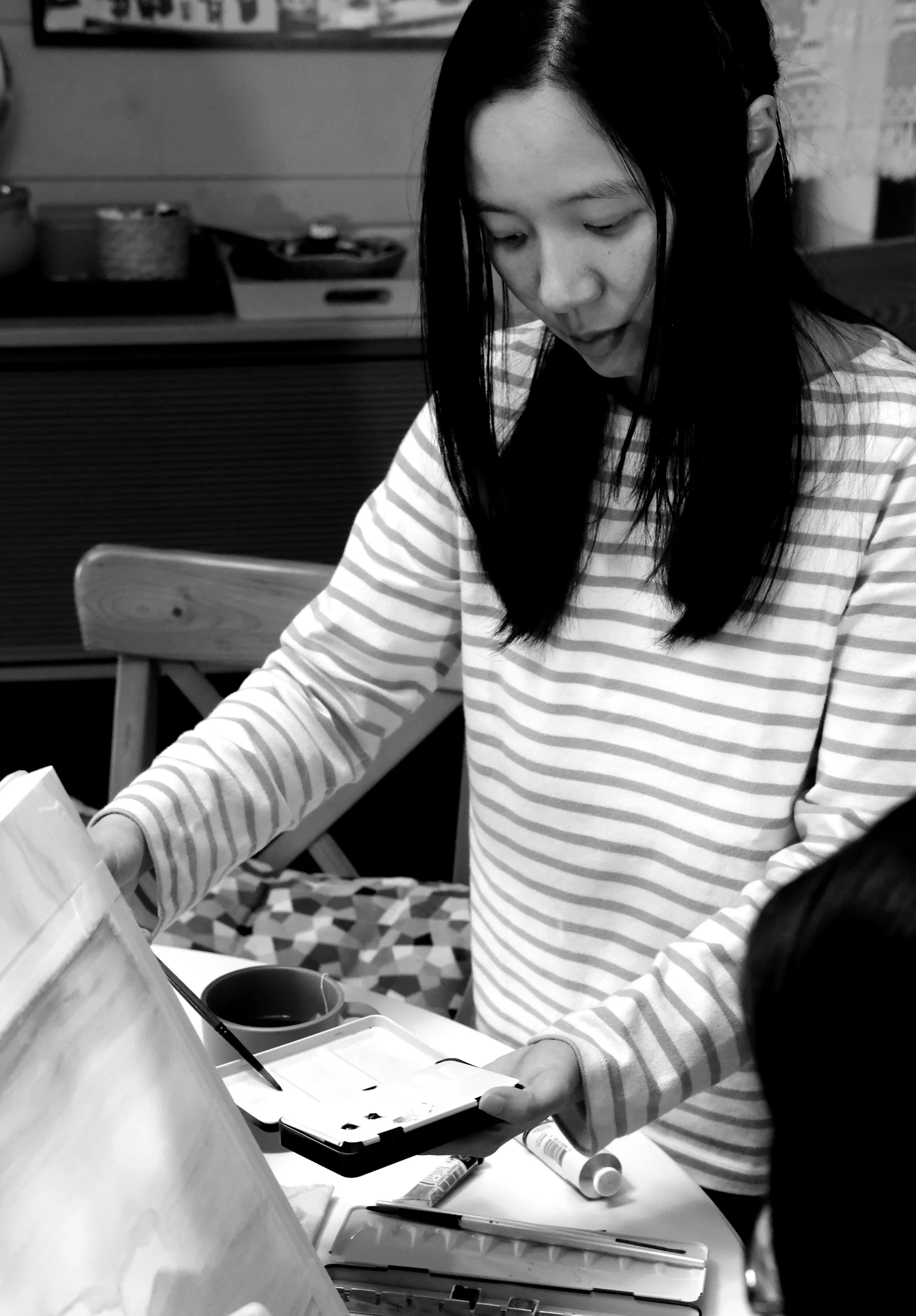
Nicole Hénusse · Graphic designer and illustrator
Nicole Hénusse is a graphic designer and illustrator in Lasne, Belgium. Her practice brings together visual identity, editorial illustration, live illustration and observational drawing.
Do you have an illustration or visual identity project?
Nicole is available for commissions and collaborations.