10 minutes of reading
Key takeaways
- A custom illustration gives visible form to your brand’s message, drawing on the gestures of your craft and the distinctive features of your business.
- An illustration accompanying a text is judged by the specific passage the drawing helps readers understand.
- An illustration adapted for several media retains its meaning when its essential elements remain legible even on a small label.
- An illustration specific to your brand has an explainable connection to your business, even when the name is hidden.
- A ready-made template or a generated image may suit an occasional decorative need, while custom work addresses a request for representation specific to the project.
In this article
- Why does a custom illustration give your brand more than a pretty drawing?
- What should you observe about your work before drawing?
- Does a beautiful image necessarily help people understand your message?
- Why does the work we perceive behind an image matter?
- Does your illustration retain its meaning across different media?
- Could this drawing work just as well for your competitor?
- Could a ready-made template or a generated image meet your needs?
- How can you decide whether a custom illustration is useful for your brand?
Why does a custom illustration give your brand more than a pretty drawing?
A custom illustration gives visible form to what your brand wants to communicate. The subject comes first. In my practice, I build brand identities through observation and drawing. Before choosing a style, clarify what the drawing should convey about your business.
“I’d like a pretty drawing” expresses a perfectly legitimate wish. Working on brand identity gives that wish a direction. In this work, the pleasure of the image and the sensitivity of the line retain their place. Ask the illustrator to explain what her proposal expresses about your brand.
What should you observe about your work before drawing?
Before drawing, observe the gestures of your craft, particularly how you handle a material or use a tool. Does your work involve shaping clay, for example? The pressure of fingers against a wall can guide the choice of a curve and the placement of hands in the illustration. To assess this proposal, ask a first question: does the drawing show a gesture you actually use?
Does a beautiful image necessarily help people understand your message?
No, an image’s beauty is not enough to make your message understandable. In their review of 55 experiments, Levie and Lentz (1982) conclude that illustrations related to the text help readers learn the illustrated content. The authors find, however, that illustrations unrelated to the text provide no learning gains.
This review concerns learning from illustrated texts. Its findings do not support a claim that an editorial illustration will automatically make a commercial offer clearer, nor do they allow a benefit for your brand identity to be quantified. For illustrated books as for an introductory page, they suggest a first criterion to examine: which specific passage does the drawing help readers understand?
Place the image beside the text it is intended to accompany and underline the sentence it should clarify, even if you already like the drawing. Then look for the element in the image that corresponds to that sentence. If the text explains a relationship between two people, for example, examine how their position or gaze makes it clear.
If you cannot name any specific connection, ask for a sketch more closely focused on the underlined passage before approving the drawing’s details.
“Working on brand identity gives that wish a direction.”
Why does the work we perceive behind an image matter?
The work we believe we perceive behind an image can increase its value in our eyes, as Kruger et al. (2004) show with poems and paintings. The authors call this tendency to judge a work by the effort we attribute to it the “effort heuristic”, especially when its quality is difficult to assess.
This assumed effort may differ from the time actually spent on creation. To examine an illustration intended for your brand, ask what the work done contributes to the project: the stated number of hours is not enough to justify choosing a proposal.
Does your illustration retain its meaning across different media?
The second criterion involves examining what remains visible as the available space decreases, from a sign to a small label. If a relationship between two shapes carries the drawing’s meaning, it must still be legible in the smaller version. For each medium, ask yourself what you can remove without changing what the image conveys.
On the page about my method, I explain that my approach applies particularly to brand identities and projects spanning multiple media. Let’s take a hypothetical example: a sign features a character holding an object. You want to retain this gesture on a label. Part of the setting can disappear, a garment can be simplified, provided that the position of the hands and the placement of the object still allow the scene to be understood without consulting the sign.
Place a printout of the label at its intended size beside the version intended for the sign. Note what disappears: losing a detail of the setting or the object held by the character calls for different decisions. Only the second belongs to the subject that needs to be retained. If that object becomes indecipherable, ask for its shape or placement to be reworked, then check the new version on the printed label.
Discover Nicole’s illustrated books and editorial work.
Two published children’s books, editorial commissions and hand-drawn identities.
Could this drawing work just as well for your competitor?
Yes, if you can replace your name with a competitor’s without the drawing seeming any less appropriate. For this third criterion, hide the name and look for what connects the proposal to your business. A symbol of your sector may suit several businesses; a detail linked to your history gives you something specific to discuss with the illustrator.
If you cannot find anything specific to your brand, indicate which part of the drawing a competitor could keep unchanged. Ask for a revision based on a distinctive feature of your business that you can explain. This gives the illustrator a more precise starting point than a request to make the image “more original”.
When an element seems specific to you, ask the illustrator which aspect of your business it relates to, beyond your preference for a colour or style. To choose between two proposals, select the proposal whose connection to your brand you can explain without relying on the name written beside it.
Could a ready-made template or a generated image meet your needs?
Yes, a ready-made template or a generated image may suit an occasional decorative need when the image does not have to carry your brand identity. In my practice, I recommend an image library or a generated image when a space needs to be filled that same day on a fixed, low budget. Custom work addresses a request for representation specific to the brand.
- First, write down what the image will be used for. “Decorate this post” allows you to look for an available visual. “Define our brand’s visual world” involves exploring what that world should express.
- Set your actual deadline. If the image must be used today, account for that constraint from the start.
- Clarify what the budget covers. Buying an image for a space and commissioning visual exploration for a brand involve different scopes. Compare proposals based on the work requested.
- Finally, reread your request before choosing the tool. Are you trying to find which image to use here, or what your brand should look like? This question guides my choice of visual language suited to the project.
How can you decide whether a custom illustration is useful for your brand?
To decide, prepare for our discussion using an actual medium and the message you want to communicate through it, expressed in a sentence. In my brand identity work, I begin by clarifying the business and its audience, then the media and the elements specific to the company. Ask me how the proposal will be examined against the three criteria presented in this article.
Frequently asked questions
Should you choose a style before contacting an illustrator?
You can start by clarifying what your brand wants to express, even if your visual preferences remain open. This intention will provide a starting point for discussing style.
Can you combine custom and ready-made images in your communications?
Yes, you can reserve custom exploration for images that need to represent your brand. A ready-made visual can meet an occasional decorative need, provided that you define the expected role of each image.
How can you give feedback on an illustration proposal without knowing drawing terminology?
You can indicate what you want to recognise in the image and where that meaning becomes unclear to you. Your feedback can draw on the passage to be illustrated or a distinctive feature of your business, without using technical terms.
Should you request more detail for a more polished brand illustration?
Not necessarily: first ask what the details contribute to the message before adding more. Simplification can preserve the subject, and the impression of work put in is not enough to establish the drawing’s usefulness for your brand.
Can you approve a brand illustration by viewing it alone on screen?
You can appreciate the drawing there, but you still need to check how it accompanies the text and how it reads in the intended medium. For print use, also examine a printout at the intended size before approving the adaptation.
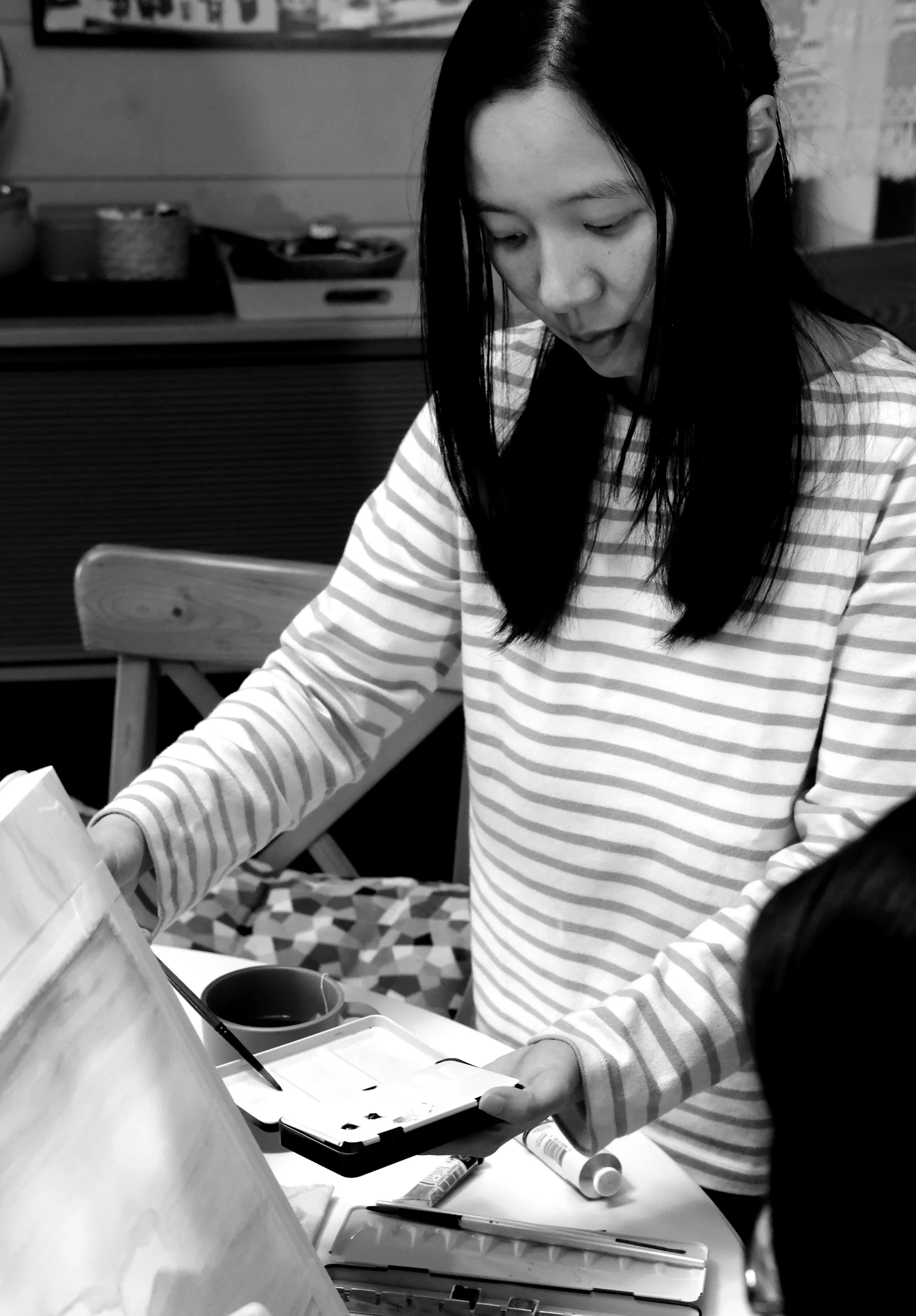
Nicole Hénusse · Illustrator and author
Nicole Hénusse is an illustrator and author of two published children’s books, based in Belgium. Her practice brings together illustrated books, editorial illustration, hand-drawn brand identity and observational drawing.
Do you have a book to illustrate or an editorial project?
Nicole takes on a small number of projects each year. Tell her about yours.