Direct answer: observational drawing trains the artist to examine gesture, proportion, volume, light and space before deciding what to simplify. It does not bind an illustrator to realism or an old-fashioned look. In my practice, it gives me more visual choices. Digital tools then help me compose, adjust and prepare the work for publication while the artistic decisions remain grounded in the story.
Training itself is not a guarantee of a successful book. A commissioner still needs to look at the evidence in the portfolio: recurring characters in different poses, readable scenes, consistent light and a visual world that survives from one page to the next.
Stylisation works best when it is deliberate
A children’s character can have a head larger than its body, very small feet and ears that would never fit through a real doorway. None of this is a mistake when the departures are chosen.
Observation helps an illustrator understand what is being changed. Where does the character’s weight sit? How do the shoulders respond when the head turns? Which shapes overlap? What makes the hand appear to hold the object rather than float beside it?
Once those relationships are understood, much of the information can be removed. A few lines can carry a convincing lean, pause or glance. The finished image may look spontaneous because the underlying choices are settled.
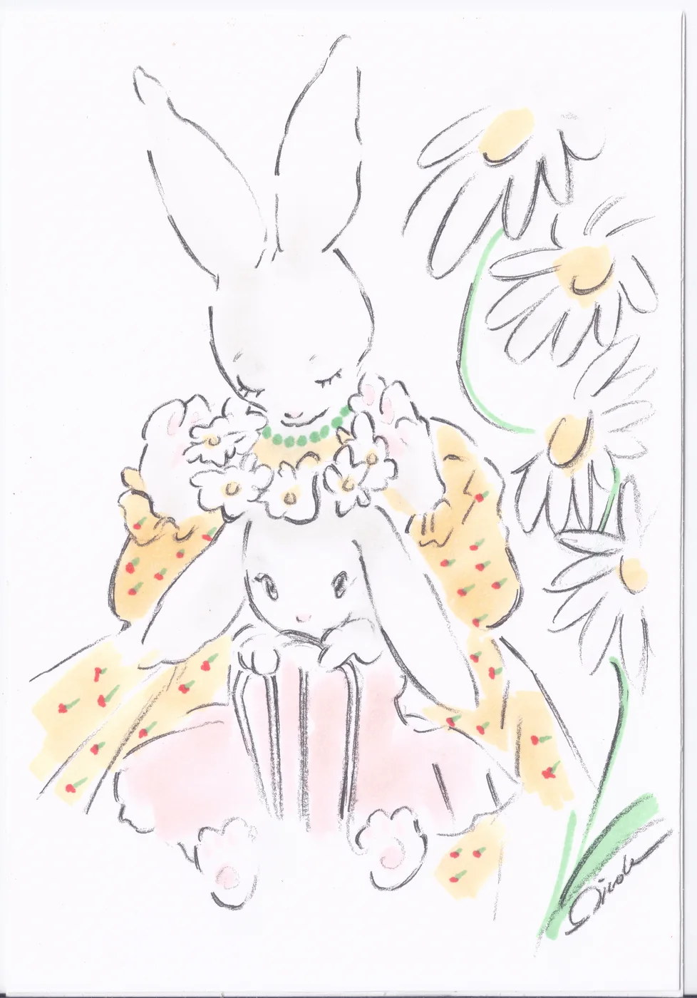
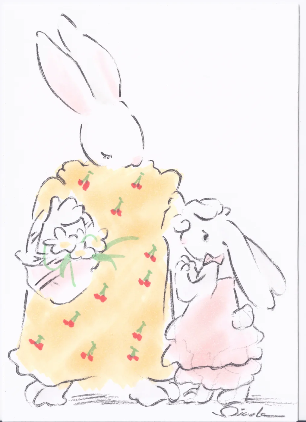
This is visible in my mother-and-daughter rabbit sequence. The figures are gently exaggerated and lightly described. Yet the exchange of flowers depends on hands, eyelines and the changing distance between the two characters. The emotional movement is carried by structure as much as by facial expression.
Gesture carries part of the narrative
Picture-book characters communicate before the reader reaches the words. A raised shoulder can suggest caution. A body pitched forwards creates eagerness. Someone looking away while everyone else faces the action may tell the reader where the real tension lies.
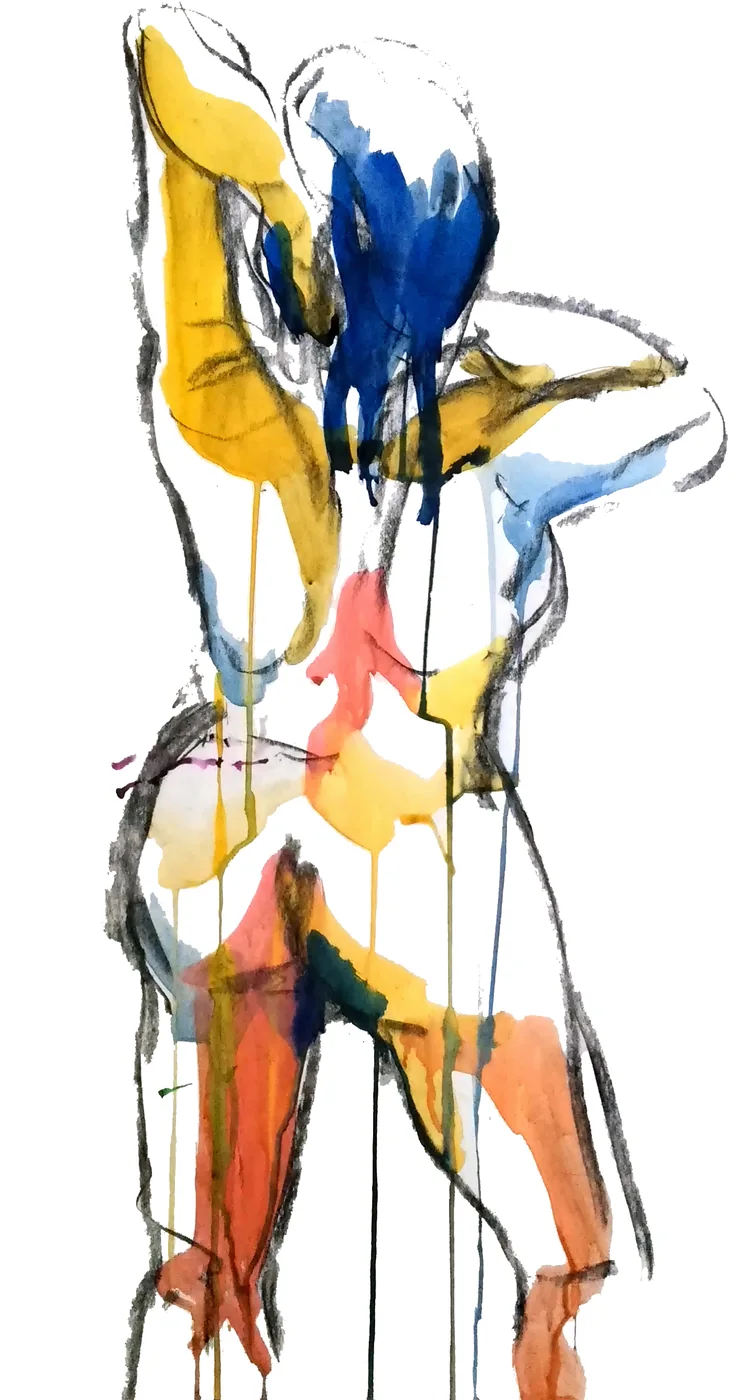
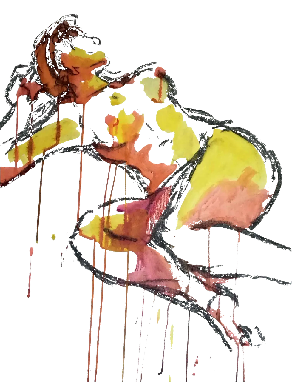
Figure drawing and animal study build a practical vocabulary for these decisions. They teach the illustrator to recognise an axis, a shift of balance and the difference between a pose held comfortably and one about to change.
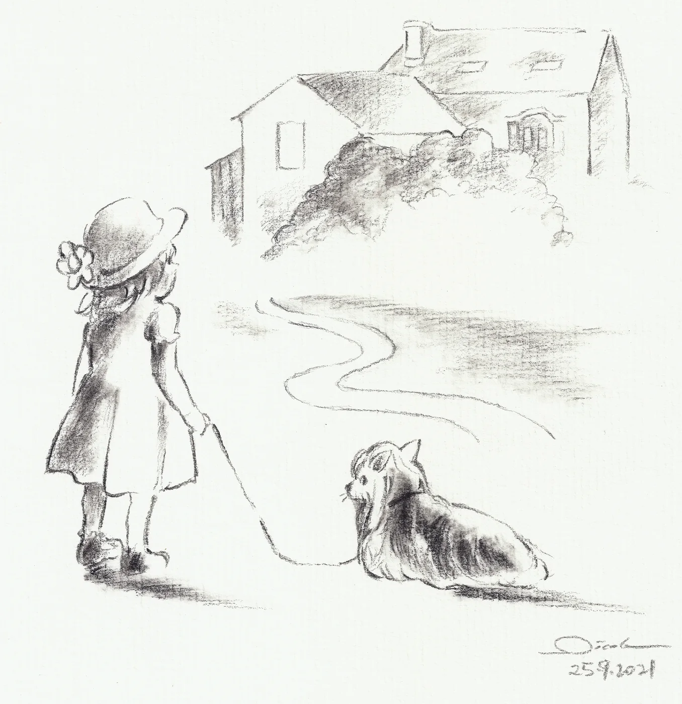
The pencil drawing of a girl and her dog uses the leash, the turn of the bodies and the road to connect the foreground to the village. The Tigrette and Lionard cooking scene is much more graphic, but each character still has a distinct line of action. Their gestures organise the scene before any detail is examined.
Light makes a simple image occupy space
Light is not merely a finish placed over the drawing. It separates forms, locates objects and directs attention.
A darker value beneath a table can anchor it. A quiet area behind a face can make the expression readable. Leaving one part of the page open may give a gesture more room than another layer of detail would.
Traditional materials make those decisions tangible. Charcoal can find large values quickly. Watercolour retains light through transparency. Gouache can build denser shapes. I choose between physical and digital media according to what the image needs to do, not because one medium is inherently more serious than another.
What research can, and cannot, support
Claims about artistic training are easy to overstate. A drawing course does not prove that one visual style is better than another, and a credential does not tell you whether an illustrator can sustain a book.
A five-month longitudinal study of 42 art students found improvements in representational drawing and several visuospatial tasks during a foundation drawing course. The researchers also found that individual change in one measure did not automatically predict change in another. The cautious conclusion is the useful one: drawing is a trainable practice with observable, but not magical or universal, effects.
That is why the strongest evidence for my method is the work itself. Figure studies show how I look for balance and form. Narrative sequences show whether those choices remain coherent when characters move, interact and reappear.
Digital production is part of the same practice
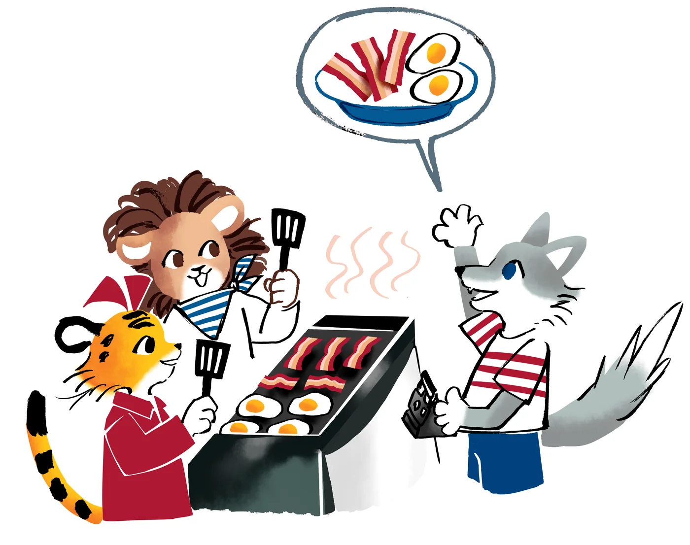
I work with physical materials and contemporary software. An image may begin in pencil, ink, watercolour, gouache or charcoal, then move into a digital workflow for composition, colour adjustment, painting, vector reconstruction or file preparation.
Digital tools are particularly useful when a book needs repeatable production. They allow me to check scale, prepare bleed, adjust values across a sequence and supply the formats required by the designer or printer.
They do not determine why a scene needs to feel quiet, which object should carry the reveal or how the reader’s eye should reach the page turn. Those decisions come from the manuscript, observation and storyboard.
See my method from observation to final files
How to assess an illustrator’s portfolio for a book
Choosing a portfolio is not a hunt for one image that resembles the picture already in your head. A book is a sequence, so the portfolio needs to demonstrate repeatable visual judgement.
Look for recurring characters
Can you see the same figure sitting, moving, turning away and interacting with someone else? A successful character should remain recognisable without being locked into one standard pose.
The rabbit sequence offers a direct test. Across five images, the mother and daughter keep their identity while their gestures and relationship change.
Compare full scenes with small elements
Books use images at different scales. A spread must organise a complete space. A small spot needs to communicate quickly while leaving room for text.
The Association of Illustrators’ guidance on illustration for children notes that commissioners look for work across formats, from full scenes to small spots, as well as confident figure work. A useful portfolio therefore solves several kinds of page problem rather than repeating one successful arrangement.
Check continuity
Clothes, props, proportions and colour relationships need to remain stable. Continuity does not mean copying and pasting a character. It means preserving identity while allowing movement, emotion and viewpoint to change.
Read the light and composition
Ask where your eye goes first and why. Do figures belong to the same space? Does the light support the mood? Can you understand the action before reading a caption?
These are practical questions. You do not need formal art vocabulary to answer them.
Connect studies to finished narrative work
Studies reveal how the illustrator observes and searches. Finished work reveals how that search is translated for a reader, page and production process. Seeing both makes the method easier to assess.
View my studies, books and narrative sequences
What this approach changes during a commission
I begin with the manuscript, readership and visual role of each scene. The storyboard tests pace, page turns and the relationship between words and images. Character studies establish the forms that must remain coherent later.
Once the direction is approved, I develop the artwork while keeping sight of the complete sequence. Observational drawing informs structure, gesture and light. Digital tools support finishing and production.
The result can be restrained, contemporary, painterly or highly graphic. The purpose is not to advertise a technique. It is to give the story a visual world that remains clear and alive throughout the book.
Frequently asked questions
What is observational drawing?
It is drawing a subject through direct looking, such as a person, animal, object or place. The practice concerns attention and spatial relationships as much as accurate proportions.
Does traditional training require a classic style?
No. It provides ways to understand form, light and composition. Those skills can support realistic, highly stylised, vector-based or digitally painted work.
Why should I look for character sequences in a portfolio?
Because a book needs continuity. A sequence shows whether a character stays recognisable across different poses, emotions, scales and settings.
Do you work digitally as well?
Yes. I use digital tools for painting, composition, adjustment, vector work and file preparation. The project determines the balance between physical and digital methods.
Discuss the visual needs of a book
Send the manuscript or a secure link, intended reader, proposed format, schedule and budget. I can then assess what the story asks of its characters, sequence and materials.