The short answer
A hand-drawn brand identity can include a mark or logo, typographic lock-ups, a colour palette, useful variants and rules for applying them to the agreed media. Drawing supplies the original material. That material can then be simplified, rebuilt as vector artwork and organised into a precise system. The final deliverable list should be defined by real uses in the proposal.
“Hand-drawn” describes where the form comes from. It does not mean that a client receives only a rough sketch. The finished identity may retain an expressive line or become clean and restrained. What connects both outcomes is an observed subject that belongs to the project.
ASSET: real-french-lockup
A logo is one part of an identity
A logo gives people a recognisable point of reference, but it rarely meets every application on its own. A wide website header, a small label and a printed certificate impose different proportions. A practical system needs to know how the same identity behaves in each of those spaces.
A project may therefore cover a primary mark, wordmark, compact and horizontal arrangements, colours, typography, spacing and a set of tested applications. It may also include a concise usage document and files prepared for the people who will actually use them.
This is not a universal bundle. A solo business applying its identity to a website and correspondence does not need the same package as a product brand working across labels and packaging. Scope is clearer when it begins with the priority media rather than an impressive but unused list of mock-ups.
What does drawing add to the process?
Most businesses already contain visual material. It may be the place where the work happens, the shape of a product, an animal, a machine, a landscape or a particular gesture. Drawing slows down the first look. It allows me to understand that subject before deciding which proportions and relationships should survive in the mark.
Research and selection alternate. Several visual directions can be explored, then assessed against the brief before one is refined. The broad rhythm resembles the Design Council’s Double Diamond: discover, define, develop and deliver (Design Council, The Double Diamond). I do not use the diagram as a fixed recipe, but its distinction between understanding a problem and producing the answer is useful.
Once the source has been understood, reduction begins. Unhelpful details go. Silhouette, balance and colour relationships become more deliberate. Some identities should keep the irregularity of the original line; others need vector reconstruction. SVG is a vector graphics format defined by the W3C and can be useful where a digital mark must scale cleanly (W3C, SVG 2). The correct final formats still depend on the agreed applications.
Real French: the material behind the mark
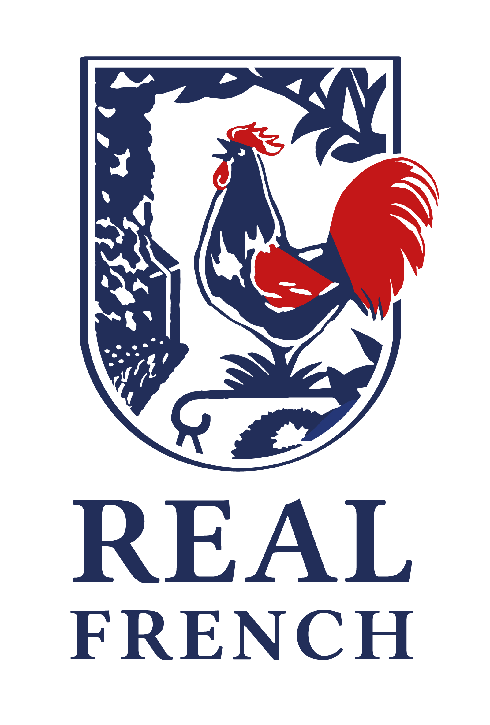
Real French provides intensive French teaching in a specific physical setting. The place and its surroundings supplied the starting material for the identity. The finished shield brings together a rooster, vegetation and an architectural presence. Deep blue, white and red organise those elements into a compact sign.
This case study makes no claim about a sales or recognition outcome. It shows a visible design transition. The material of the place is contained within a mark; that mark is paired with the name; the system is then used on a printed certificate. Each stage can be inspected without inventing a performance result.
ASSET: real-french-mark
From a complete drawing to a practical sign
A source drawing usually holds more information than a logo can carry. Simplification establishes hierarchy. In the Real French mark, the rooster becomes the immediate focal point. The frame, landscape and lettering support it. A limited palette separates parts of the drawing without relying on extra effects.
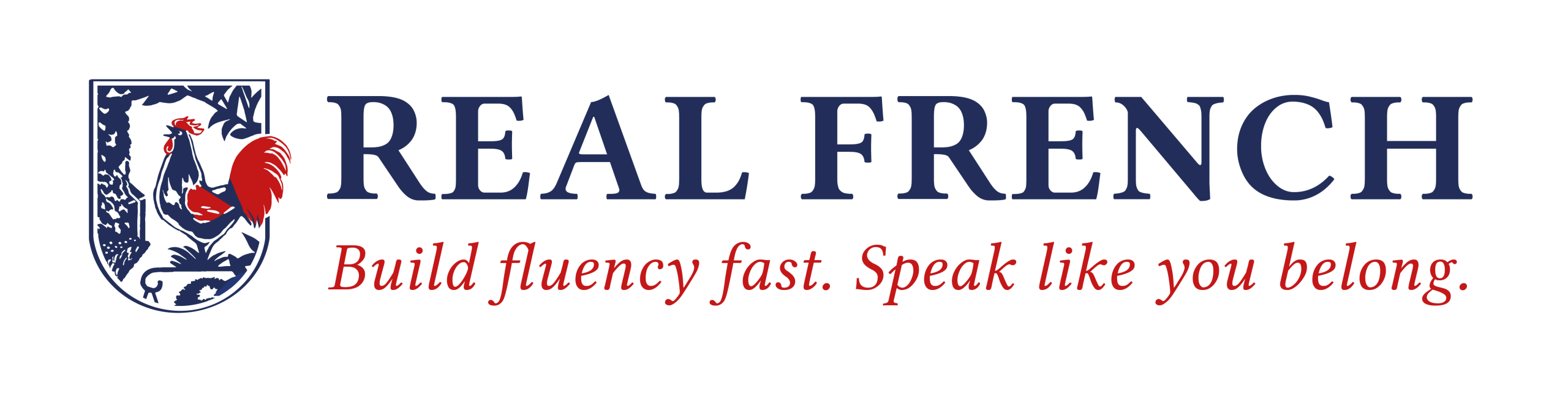
The mark can then meet the name in different proportions. A vertical arrangement suits a narrow space. A horizontal lock-up works across a header. They are not competing designs. They are controlled forms of the same identity.
Less visible decisions matter here. How much clear space protects the mark? At what size do the internal details stop reading? Does a particular application need a reduced or single-colour version? Those questions are best answered against the media the business will use, not in isolation on a presentation board.
The printed certificate is part of the proof
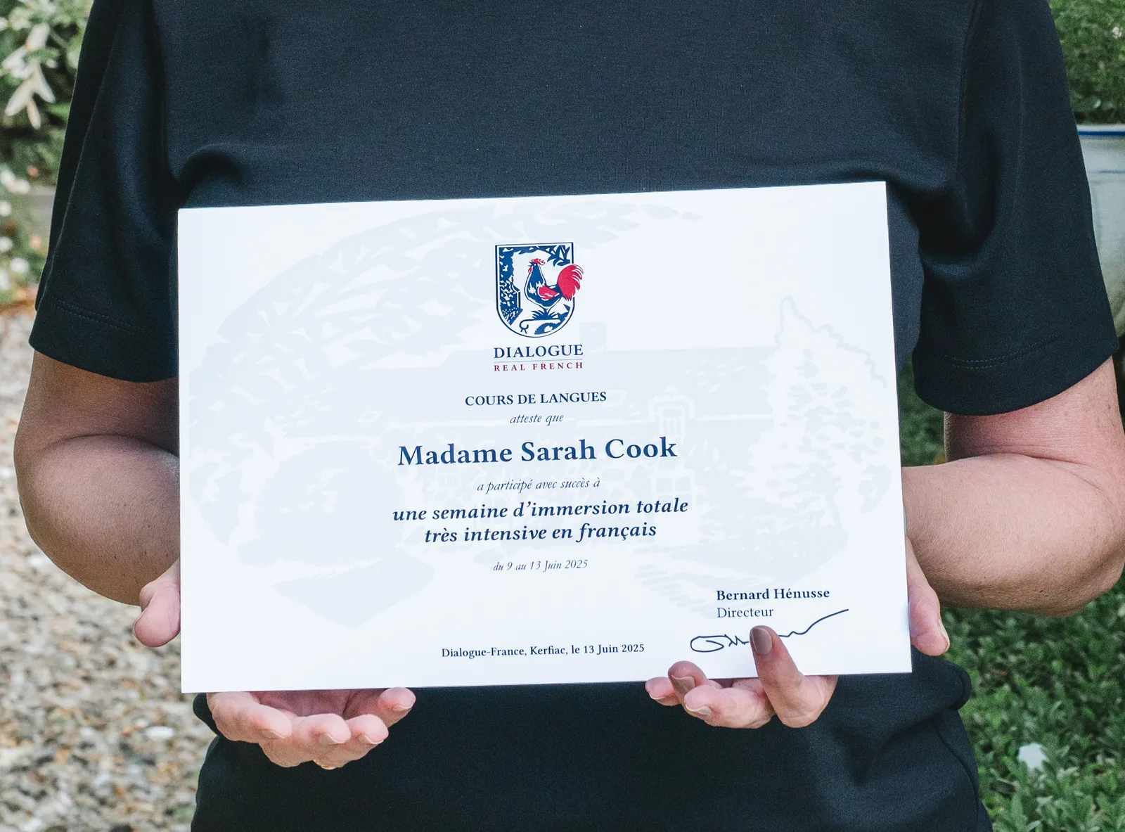
A logo board can only show an identity in ideal conditions. An application shows how it shares space with information. On the Real French certificate, the shield appears at a small scale above the main text. A pale expansion of the drawn setting sits in the background while the recipient’s information remains dominant.
The certificate does not prove that the system covers every future use. It demonstrates one completed application and the decisions needed to make the identity serve a document rather than compete with it.
ASSET: real-french-certificate
What should the proposal state?
Begin with use. Name the priority media, the people who will handle the files and the smallest or most demanding places where the identity must work. A proposal can then set out research, review points, the number of initial directions and the final components to be supplied.
The file list should be understandable rather than merely technical. A printer, developer and office user may require different versions. Colour, background and size variants should be tied to those needs. Editable source material should never be assumed to be included or excluded; it belongs in the written scope.
It also helps to separate immediate applications from later extensions. A well-tested system for the website, documents and one core printed item is more useful than a long collection of speculative mock-ups. New media can be added when there is a real production requirement.
What should you bring to the first conversation?
Describe the activity plainly and say what the audience should recognise. Gather the current logo, documents, website pages or labels, including the pieces that no longer feel right. Add known restrictions such as a tiny label size, an established website structure or a print process.
Then bring the material that is genuinely yours. Photographs of the place, product or working process often offer more substance than a mood board made only from competitors’ logos. They give the drawing something specific to observe.
The Brand Identity service page shows this project beside other completed work. My Method explains how observation, drawing, selection and final production connect.
Frequently asked questions
Is a hand-drawn identity difficult to use online?
No, provided it is developed for the intended media. A drawing may be cleaned, reconstructed or vectorised. It can keep evidence of the hand while being supplied in suitable digital formats. The brief needs to identify where the smallest and largest versions will appear.
Does the service always include a full brand-guidelines document?
Not automatically. The right level of documentation depends on who will apply the identity and across how many media. A founder using a small set of files may need a short, practical guide. A team or several suppliers may need more detailed rules. The proposal should name the documentation included.
Can I commission only a logo?
A limited scope can be discussed, but the intended applications still need to be known. Otherwise a mark may be approved at presentation size and fail in its main use. My current brand identity service starts from €2,500.
Do I need to choose the colours and typefaces first?
No. Existing constraints and preferences are useful, but colour and typography can be part of the design work. It is more important to explain what the business does, who it speaks to and where the identity will be used.
What should I send with an enquiry?
Send a short account of the activity, the priority applications, what already exists and the material that belongs to the project. That might be a place, object, product, story or working process. Include the timetable and the people who will approve the direction.
Build the identity from the subject itself
I can study the business, develop its visual material through drawing and turn the chosen direction into the mark, type, colour and applications it actually needs.
References
- Design Council, The Double Diamond, accessed 19 July 2026.
- World Wide Web Consortium, Scalable Vector Graphics (SVG) 2, technical specification.